


Filters


What Dark Academia means in furniture
Dark academia is an interior language built around study, ritual, and restraint. It is not a costume. It is a method for shaping atmosphere with proportion, texture, and controlled contrast. The dark academia aesthetic often reads as quiet and scholarly because the room is designed to hold attention slowly. Dark academia décor works best when it behaves like architecture, not as scattered objects trying to explain a theme.
In a dark academia house, the furniture carries the mood before any accessory arrives. Dark academia style depends on weight, finish, and placement. A dark academia room should feel composed whether it is an office, a dining space, or a living area, with storage that keeps surfaces calm and materials that look better with time. When you move through dark academia rooms, the most convincing ones do not announce themselves. They hold stillness through structure. That is what a dark academia house interior aims for, and what a dark academia home becomes when decisions are made in the right order. The result is a dark academia interior that feels lived in, not staged, and a dark academia room décor approach that can evolve without losing cohesion.
If you want a clear starting point, treat this collection as a framework inside broader modern furniture design. The aesthetic is specific, but the principles are transferable across modern interior aesthetics. Scale first. Material second. Light third. Objects last.
Collection boundaries
This collection leans vintage in spirit without imitation. It favors grounded silhouettes, matte surfaces, and materials that hold patina. It avoids novelty motifs, glossy finishes, and bright, high-contrast upholstery that breaks the room’s calm. It is built to support moody interior design styles without relying on decoration to do the heavy work.
If you prefer to plan by function first, use curated home design by room to map what each space needs, then return here to align finish, texture, and proportion into one interior language. For a wider view of interior design aesthetics and room planning, see aesthetic room decor as a reference for how different interior decor styles explained can be applied without turning a home into a trend exercise.
The material rules that make it believable
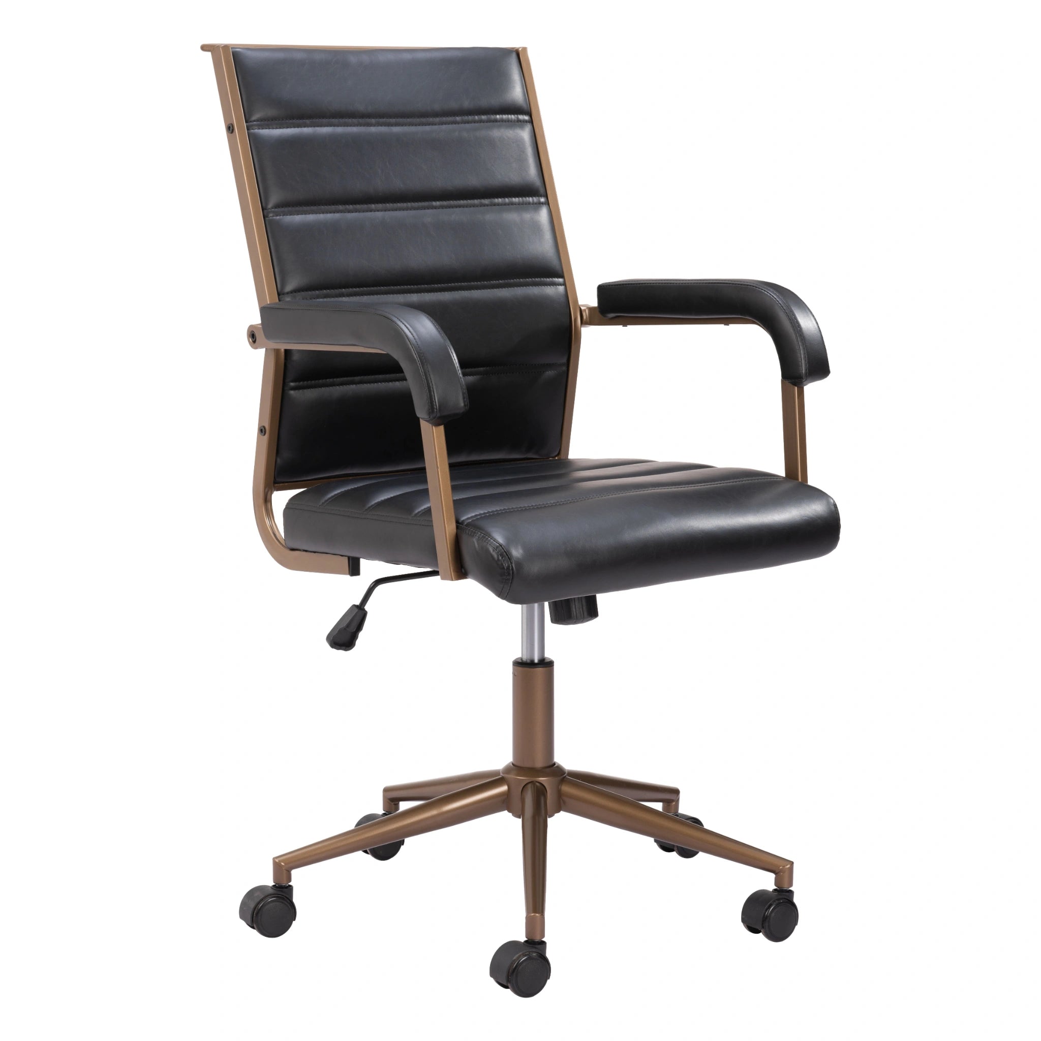
Authority in this aesthetic comes from materials that do not shout. Choose two wood tones, then stay loyal. Let one metal finish act as a constant, antique brass, dark bronze, or blackened steel. Keep sheen controlled. Matte and satin finishes absorb light and protect the atmosphere. High gloss tends to read as modern spectacle, not study.
Depth should come from textures more than colors. Wool rugs, leather with patina, heavy linen, and tactile weaves give the room weight. Velvet can work, but only as a controlled accent, not as a full-room decision. Ceramic and stone add quiet density. Use vases and candles as surface texture, not as decoration that tries to create a vibe on demand. When materials are correct, the room does not need many objects to feel complete.
Proportion cues that read as scholarly
Dark rooms fail when furniture feels thin. Look for thicker tops, deeper desk surfaces, and case goods with visual weight. Legs should not be spindly. Storage should feel stable, not temporary. This is the practical difference between aesthetic home inspiration and a room that holds up in daily use. In design styles for rooms that lean moody, thickness and depth do more than color.
If a space feels unsettled, it is often because the furniture sizes are unrelated. Repeat one dimension across the room, a consistent height band, a recurring wood tone, or a shared line. Cohesion is repetition, not variety.
A build method that reduces decisions
1) Choose the anchor
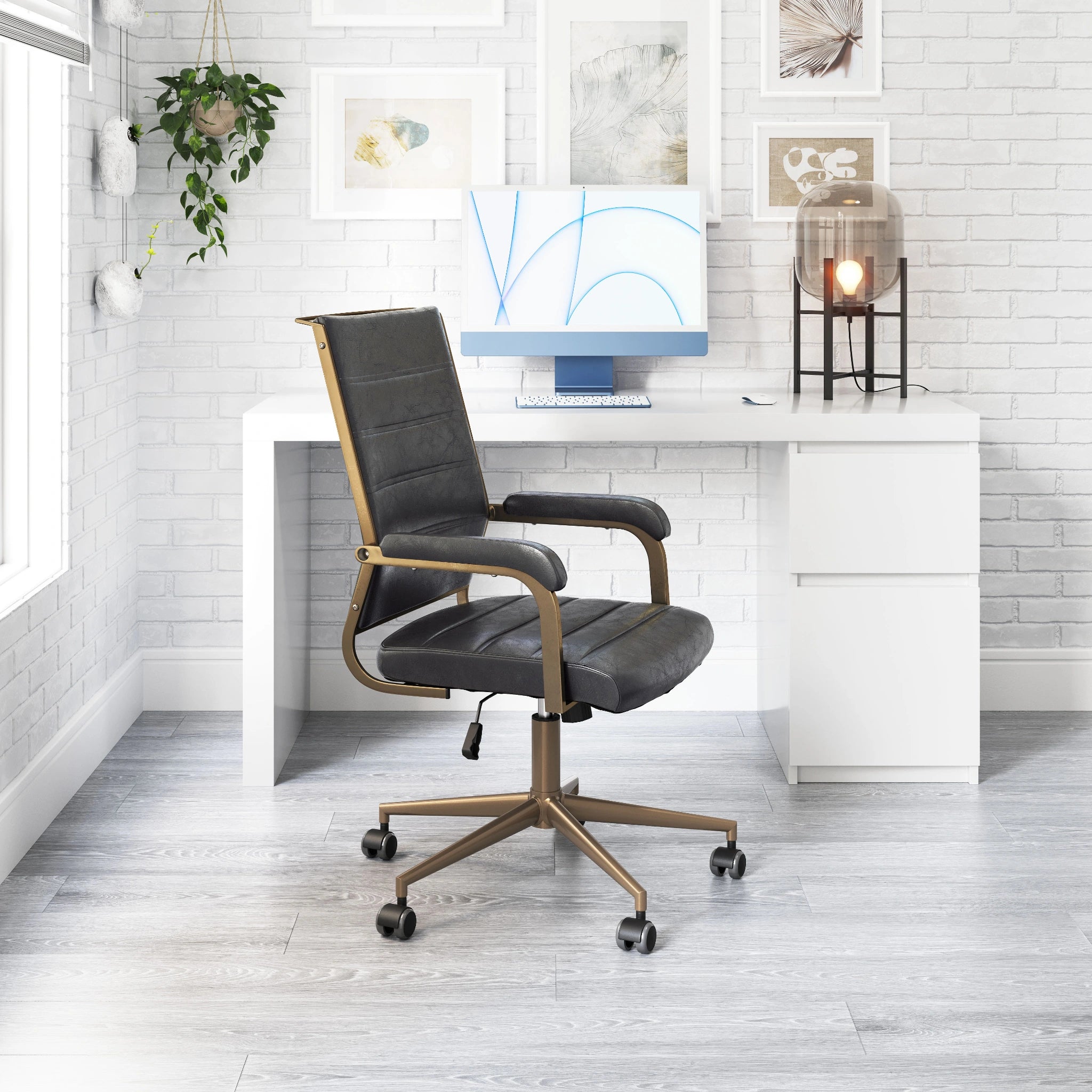
Start with a single anchor piece that sets posture and scale. A desk, a sideboard, or a substantial table can do this. The anchor should relate to the wall plane behind it and establish the room’s line weight. If the anchor feels wrong, the issue is usually finish or scale, not the object category.
2) Add shelves and storage that quiet the surfaces
Shelves and storage are not an afterthought in this aesthetic. They are the mechanism that keeps the room calm. Use fewer, heavier shelves rather than many small ones. Keep the display portion restrained. Closed storage matters because it protects the surface story. When storage is correct, the room can feel cozy without becoming cluttered, and minimalist without looking empty.
3) Establish statement lighting as punctuation
Statement lighting belongs when it behaves like punctuation rather than performance. One primary source sets the center of gravity. A secondary source, lower and softer, makes corners legible and reveals texture gradually. The goal is not brightness. It is arrangement, where light lands, where it falls away, and how it shapes the room’s atmosphere.
4) Make one wall decision
Choose a gallery wall or a mirror strategy, not both at full volume. A gallery wall works when spacing is measured and frames share a finish family. Mirrors should borrow light and return it gently, not multiply glare. Wall accents should read as architecture, not as scattered decoration.
What to avoid
The fastest way to break the aesthetic is to overstate it. Avoid cold overhead lighting, under-scaled rugs, and too many small frames competing on one wall. Avoid bright whites that turn every edge into contrast. Avoid glossy black that reads as reflective and loud. Avoid novelty gothic motifs that force the room into a costume. The goal is a room that feels authored, not one that performs a theme.
Diagnosis tools that save the room
If it feels heavy but not warm
The contrast is too sharp, or the lighting is too direct. Reduce glare. Add a second light source at a lower height. Introduce a rug with more texture, not more pattern. Ambiance is built through gradient, not darkness.
If it feels themed
Remove the obvious cues first. Keep the furniture, simplify the objects, and let one material carry authority. If the room collapses when accessories leave, the system is not doing enough work. Upgrade one piece with better finish and scale instead of adding more decor.
If it feels scattered
Scale is inconsistent. Choose one anchor, then one supporting piece that repeats its wood tone or line. Let everything else serve that relationship. This correction works across popular home decor aesthetics, and it is especially effective here because restraint is the point.
A small checklist that confirms the room is working
If these three conditions are true, the space will read as dark academia without forcing it. The anchor piece sets posture and scale. Storage reduces surface noise so the room stays calm. Light is layered, with at least two sources that create depth rather than uniform brightness. When those are in place, rugs, mirrors, cushions, and objects can be added sparingly, and the room will still hold together.
Where AURA Modern Home fits
AURA Modern Home curates luxury furniture with an editorial focus on proportion, material honesty, and long-term cohesion. Pieces are selected to support a composed room, where textures do the work and the atmosphere is built into the structure. If you want an interior that feels restrained and authored, start with the system, then allow the details to arrive slowly. For the broader AURA point of view, begin at Atmospheric home decor and move outward from the collections that match your material preferences.
Common questions about dark academia furniture
Before a room comes together, the same questions surface: what the style actually is, which colors and materials carry it, how it differs from gothic and old money, and how to choose pieces that stay elegant. We gathered answers to common dark academia furniture questions in one place, each kept short and direct. Read them first if you are still deciding, then come back to the pieces.