
I spent the better part of a year living with a sofa that was technically the right color but somehow made every room feel like a dentist's waiting area. Neutral gray. Clean lines. All the "right" moves. And yet the space had zero pulse. No warmth. No gravity. It took me an embarrassingly long time to realize that modern interior design isn't about following a checklist of approved materials and muted tones. It's about tension. The quiet friction between a raw stone surface and a polished brass lamp. The way a walnut credenza anchors a room that would otherwise float away into beige nothingness. I got it wrong before I got it right, and most of the lessons cost me a restocking fee.
The AURA Blueprint
Modern interiors work best when they feel edited, not erased. The room should read calm at first glance, then slowly reveal weight, texture, and a few sharper decisions as you stay with it.
- Start with weight: Choose one grounding material, usually walnut, oak, stone, or a dark upholstery tone, before you start layering lighter finishes.
- Limit the palette: Two dominant materials and one accent finish is often enough. A fourth strong material usually needs a very good reason.
- Use space deliberately: Leave breathing room around key pieces, but make the anchor furniture large enough that the room still feels composed rather than under-furnished.
- Layer the light: Overhead light handles visibility. Lamps, sconces, and reflected light create the atmosphere people actually remember.
Modern house interior design has been misunderstood for decades. People hear "modern" and picture cold, sparse rooms with nothing on the walls. The best modern interiors I've lived in, worked in, and obsessed over are anything but cold. They're layered. They have weight. They feel like someone actually lives there, probably with a dog and a stack of books they'll never finish.

Modern vs. Contemporary: The Distinction That Actually Matters
I can't tell you how many times a client has told me they want a "modern contemporary" room, as if those two words are just synonyms wearing different outfits. They aren't. The confusion costs people real money, because they end up buying furniture that belongs to one philosophy while decorating for another.
Here's how I explain it. "Modern" refers to a specific design movement rooted in the early to mid-20th century. It has a fixed vocabulary: clean geometry, functional forms, and an honest relationship between structure and material. Think Mies van der Rohe. Think Eames. Think rooms where every object could explain why it's there.
"Contemporary" is a moving target. It describes whatever is happening right now, borrowing from modern principles but shifting with modern decor trends and cultural mood. Contemporary rooms might pull from Japandi restraint one year and maximalist warmth the next. The bones change.
What does this mean for your modern house interior? Choose your anchor first. Root the room in modern principles, the clean lines, disciplined proportions, and material honesty, then layer contemporary touches on top without letting the room lose its identity. The foundation stays. The surface can breathe. That is the approach I recommend for anyone building a room they want to live in for more than two trend cycles.
Color and Material: Where the Room Gets Its Voice

Color and material choices are where a modern interior either comes alive or dies quietly in good taste. A neutral palette is the foundation of most modern interiors, and for good reason. It creates calm. It lets other elements breathe. But "neutral" does not have to mean timid.
The palettes I keep coming back to start deep and warm. Charcoal over white. Warm taupe over cool gray. Occasional moments of muted color, navy or sage, placed with the precision of a single sentence in a long paragraph. A burnt sienna cushion on a dark sofa does more work than an entire accent wall in the wrong shade. Restraint is not the absence of color. It is the discipline to place it where it actually registers.
Explore our Curated Sofas & Deep Seating for the Dark & Moody Aesthetic

110" Dark Brown Corner Modular Sectional (OA-1050-20) by Moe's Home Collection

150" Dark Brown U-Shape Modular Sectional (OA-1049-20) by Moe's Home Collection

115" Dark Brown Classic L Modular Sectional (OA-1048-20) by Moe's Home Collection

115" Dark Brown Dream Modular Sectional (OA-1047-20) by Moe's Home Collection


One practical rule helps here: choose one dominant wood tone, one dominant upholstery tone, and one metal finish before you add anything else. That gives the room a spine. After that, ask whether each new material is adding depth or just adding another surface to notice. Most modern rooms get better when you stop at three strong finish families and let texture do the rest.
Materials are where things get personal. Glass, metal, and wood are the classic trio, and they've earned their place. Glass creates transparency. Metal adds edge, especially in blackened or patinated finishes. Wood, particularly walnut and oak, brings warmth and organic beauty that keeps a modern room from feeling like a showroom after hours.
But the rooms I find myself thinking about weeks later are the ones that play with tension between raw and polished. A honed stone dining table next to velvet upholstered chairs. A rough-sawn oak shelf holding a single polished brass object. That contrast is what creates depth. Without it, you just have a room full of nice things that don't talk to each other.
If you want a room that pulls you in and holds you there, a wood accent wall or a woven rug with real texture will do that work quietly and well. Something more spare and architectural? A glass surface or metal shelving might be the right call. Even then, add one warm element. Just one. The room will thank you.
| Material | Best For | Watch Out For | AURA Pairing |
|---|---|---|---|
| Walnut | Warmth, grounding, timeless appeal | Reads too traditional without modern silhouettes | Brass lighting and stone accents |
| Oak | Lighter warmth, Japandi and Organic Modern rooms | Lighter tones can wash out in very bright spaces | Linen textiles and matte black hardware |
| Aged Brass | Accent lighting, hardware, sculptural objects | Too much reads gaudy. Punctuation, not a paragraph | Pendants, sconces, tabletop decor |
| Stone / Marble | Dining tables, coffee tables, consoles | Can feel heavy and cold without textile balance | Velvet seating and warm-toned rugs |
| Glass | Openness in smaller rooms | Shows every fingerprint. Requires commitment | Sparingly, as shelving or table surfaces |
| Blackened Metal | Industrial edge, shelving, fixtures | Cold without wood or textile counterpoints | Walnut shelving and leather accents |
Furniture, Negative Space, and Removing Visual Stop Signs

In a modern interior, furniture and decor are more than functional elements. They give a room its character, its weight, its reason for being walked into. The goal isn't to fill a floor plan. It is to create a composition where every object earns its square footage.
The principle I come back to most often is negative space. Not empty space. Negative space. The difference matters. Empty space is what happens when you haven't finished furnishing. Negative space is a deliberate decision to let the room breathe, to give the eye somewhere to rest between moments of visual weight. I think of it as removing visual stop signs. Every unnecessary object, every piece of decor that exists only because the shelf looked bare, is a stop sign. It interrupts the flow. It makes the room feel smaller and louder than it needs to be.
Every piece of furniture and wall decor should have a purpose. I suspect this is where most people go wrong early on. They fill the room because empty space feels like a mistake. It isn't. It's the thing that makes everything else visible.
Furniture with clean lines and simple shapes tends to work best. Sleek metal or wood frames. No ornate or fussy details. Sectional sofas, platform beds, geometric coffee tables. All strong options. But the pieces that really sing in a modern interior carry that tension I keep circling back to. A sofa with clean architectural lines upholstered in something deeply textured, a nubby wool or a worn leather. A coffee table with a raw stone top on a polished brass base. The raw and the polished, sitting together. That is where the room starts to feel alive.
Mixing different furniture styles can create a visually interesting space, too. The key is shared tone or material language. A mid-century modern furniture piece, such as an armchair, paired with a contemporary sofa in similar shades of charcoal creates conversation between the pieces without conflict.
For a focal point, consider one statement piece. A bold artwork. A unique light fixture. A sculptural coffee table. One. Maybe two. A single brass pendant over a dining table does more than three competing fixtures ever could. The best rooms I've put together weren't the ones where I bought the most. They were the ones where I removed the thing that didn't belong.
Useful spacing rules for modern rooms
- Leave roughly 14 to 18 inches between a sofa and coffee table so the room feels relaxed, not crowded.
- Aim for 30 to 36 inches of walking space on major paths when the room allows it.
- Use one large rug or a properly scaled one. In living rooms, the front legs of the main seating should usually sit on the rug rather than float around it.
- If a piece looks delicate against the room's architecture, it probably is. Modern rooms need clean silhouettes, but they still need visual mass.
Lighting Is the Room

Probably the topic I have the strongest opinions about. Lighting can make a beautifully furnished room feel flat, or make a modestly furnished room feel cinematic. It's that powerful, and it's that frequently mishandled.
The key principle is layering. Multiple light sources at different heights, serving different purposes, creating dimension instead of just illumination. Recessed lighting, pendant lights, floor lamps. By using a variety of sources, you build atmosphere that a single overhead fixture cannot produce. One overhead light is not a lighting plan. It's a surrender.
Explore our Dark Academia Lighting: Industrial Pendant Lights & Moody Fixtures


Natural light plays an equally critical role. Sheer or translucent window treatments allow light to filter through while maintaining privacy. The quality of light changes throughout the day, and a well-designed modern room should change with it.
What people usually miss is that modern lighting has to be scaled with the architecture, not just matched to the furniture. Over a dining table, a pendant usually lands well when it hangs about 30 to 36 inches above the surface. Bedside sconces tend to work best when the light source sits near shoulder height while you're seated in bed. In living rooms, at least one lamp should sit below eye level when seated, so the room glows rather than glares.
Small Spaces and the Illusion of Volume
If your space lacks natural light, or if you're working with a smaller room, lighting becomes your most important spatial tool. Strategically placed mirrors and metallic surfaces reflect both natural and artificial light, creating depth and volume that the square footage alone can't provide. A brass tray on a console table. A mirror angled to catch a window. The reflective surface of a polished stone tabletop. These aren't decorative choices. They're spatial ones.
Recessed lighting or uplighting creates the illusion of height. Table lamps or floor lamps with adjustable shades let you direct light where it's needed and create intimacy in specific zones. The goal in a small space isn't to flood it with brightness. It's to create pockets of warmth that make the room feel larger by giving it layers.
The most common lighting mistake I see is a single overhead light doing all the work. Harsh shadows. An uninviting atmosphere. No amount of good furniture fixes that. The second most common mistake is scale. Fixtures too small or too large for the space throw off the balance of the entire room.
| Lighting Layer | Purpose | Best Fixtures | Common Mistake |
|---|---|---|---|
| Ambient | Overall room illumination | Recessed lights, large pendants | Relying on a single overhead source |
| Task | Focused light for reading, cooking, working | Table lamps, desk lamps, under-cabinet | Choosing style over function, ending up dim |
| Accent | Highlighting art, architecture, objects | Sconces, picture lights, uplights | Skipping this layer entirely, flattening the room |
| Decorative | Visual interest and mood | Sculptural pendants, candles, statement lamps | Oversizing the fixture for the room |
Bringing It All Together, Room by Room

The real test of a modern interior isn't any single piece. It's how the room holds together when you step back and take it in as a whole. Color, material, furniture, and light all need to be in conversation. Not matching. Conversing.
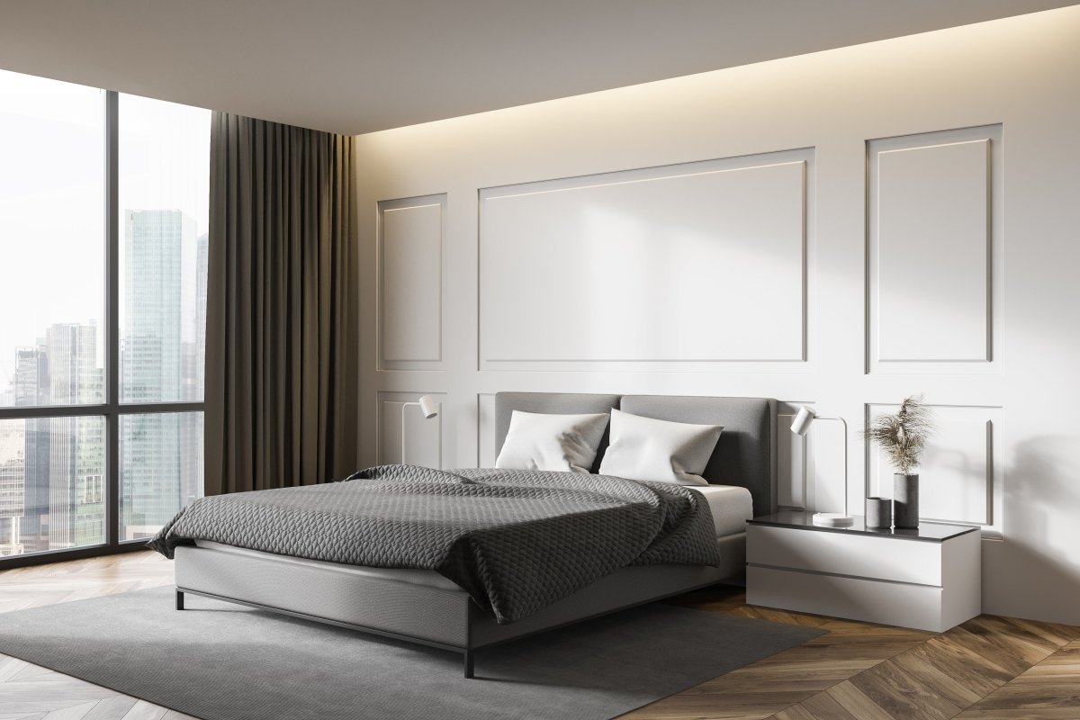
In a living room, that might mean a deep charcoal sofa grounded by a stone coffee table, with a single brass pendant pulling the eye upward. A bedroom could be a low walnut platform bed with linen bedding and a pair of warm sconces replacing the usual bedside lamps. A dining room, a solid wood table surrounded by upholstered dining chairs, lit from above by something sculptural and warm.
The rooms that feel the most complete are the ones where someone made a few strong decisions and then stopped. They didn't fill every corner. They didn't add a sixth throw pillow. They let the materials and the light do the rest. They left enough negative space for the room to actually feel like a room, not a storage unit with good taste.
You don't have to be an interior design expert to build a modern interior that feels this way. Start with one room. Get the bones right: a grounded palette, one or two pieces with real material presence, lighting that creates layers instead of flatness. The rest tends to follow. Rooms have a way of teaching you what they need, if you're willing to listen and, more importantly, willing to remove the things that are shouting over them.
The Room After the Last Guest Leaves

Modern house interior design is simplicity with substance. A grounded palette, clean lines, and negative space are the bones. Walnut, stone, aged brass, and blackened metal are the muscle. Lighting, layered and considered, is the thing that makes the whole body move.
The furniture you choose should carry tension between raw and polished, between warmth and edge. The decor you keep should earn its place. The space you leave empty should feel just as intentional as the space you fill.
The best rooms aren't the ones that follow every rule. They're the ones that feel settled. Not staged for a photo, not stripped down for the sake of virtue, not updated every time the algorithm discovers a new beige. They hold their shape in daylight, under lamplight, and after the last guest leaves. That's the test. If the room still feels grounded when nothing in it is performing, you've probably done it right.
Frequently Asked Questions
What is the difference between modern and contemporary interior design?
Modern interior design refers to a historical design language rooted in the early to mid-20th century, with clean geometry, functional forms, and material honesty. Contemporary design is about what feels current now. The smartest rooms usually take their structure from modern design, then borrow a few contemporary touches so they still feel alive.
How do you make a modern room feel warm instead of cold?
Start with one grounding material such as walnut, oak, dark upholstery, or stone. Then layer texture rather than more color. Linen, wool, velvet, aged brass, and warm-toned lighting do more for a room than filling it with decorative extras. The mistake is usually not that the room is too modern. It is that the room is too smooth, too bright, or too under-layered.
What colors work best in a modern house interior?
The most convincing palettes usually begin with warm neutrals and darker anchors: charcoal, taupe, walnut, blackened metal, stone, and off-white rather than bright white. You can add muted color, but it tends to work best in controlled moments. One rust cushion, one olive chair, one smoky blue artwork. Modern rooms usually improve when color is placed with restraint.
How much negative space should a modern room have?
Enough that the eye can rest, but not so much that the room feels under-furnished. In practice, that usually means keeping surfaces edited, leaving clear walking paths, and using fewer but larger pieces instead of many small ones. A room should feel calm, not abandoned.
What is the biggest mistake people make with modern interiors?
Usually one of two things: they under-scale the furniture, or they rely on a single overhead light. Both mistakes make the room feel flatter and less intentional than it should. A modern room still needs visual weight, layered light, and enough material contrast to feel lived in. For a related look at what current rooms are borrowing from the modern vocabulary, see AURA's modern decor trends article.

Todd Harmon
Modern rooms only become memorable when restraint meets material gravity. That balance, clean silhouettes held in place by wood, stone, shadow, and warmth, sits at the center of Todd’s design point of view. With over two decades in e-commerce and product curation, Todd’s work is defined by a rejection of sterile minimalism in favor of the "moody interior." As the creative architect behind AURA Modern Home, his focus lies at the intersection of mid-century architecture and contemporary shadow, prioritizing material authority and the psychological impact of a well-composed room.

Leave a comment
This site is protected by hCaptcha and the hCaptcha Privacy Policy and Terms of Service apply.