
How to Use Bold Colors in Modern Decor: Tips & Tricks
Bold color can wake up a modern room in a way neutrals rarely can, but the difference between vivid and chaotic usually comes down to control. The rooms that get it right are not louder, they are clearer: one strong move, a supporting cast, and enough restraint for the architecture, materials, and light to stay legible.
The AURA Blueprint
Bold color works best when it feels placed, not sprinkled around. Start by deciding where the room should carry its intensity, then let everything else support that decision.
- Pick one leader color first, then add one supporting hue and one stabilizing neutral.
- Test color in light you actually live with. Morning sun, gray afternoons, and warm lamps all change saturation.
- Avoid stacking statements too early. A bright wall, patterned rug, and sculptural sofa can work together, but rarely on the first pass.
- Use texture strategically because velvet, tile, lacquer, linen, and matte paint all hold color differently in the same room.

The Psychology of Color
Color does affect how a room feels, but not in a simplistic paint-by-emotion way. Warm hues often read as more animated and social. Cooler hues tend to feel quieter and more receding. Saturation matters just as much as hue. A muddy olive and a high-gloss emerald do not create the same atmosphere, even though they belong to the same family.
Light changes the story again. A terracotta wall that feels grounded in afternoon sun can skew heavier at night under warm bulbs. A vivid blue may look crisp in a bright room and flat in a north-facing one. That is why swatches on a phone or a tiny paint chip often mislead people. You are not choosing a color in isolation. You are choosing how that color behaves on a surface, in a specific room, at different times of day.
There is also a personal dimension to all of this. Cultural associations, memory, and context shape response, even if broad patterns still hold and colors can make us feel different emotions. Use those general rules as a starting point, then calibrate for your own space.

(source: @villa_pocket)
Choosing Your Bold Colors
Before you pick a color, decide what role it needs to play. Do you want the room to feel more architectural, more playful, more intimate, or more graphic? That answer matters more than simply deciding you “want something bold.” Once the role is clear, these color relationships become much easier to use well.
1. Color wheel basics
The color wheel is still one of the easiest ways to keep a room coherent. It gives you a visual map of what will harmonize, what will contrast, and where tension might feel intentional instead of accidental. A practical way to use it is to choose one lead color first, then decide whether the room needs a close neighbor, an opposite, or a tonal variation.

2. Analogous color schemes
Analogous schemes use colors that sit next to each other on the wheel, which makes them one of the safest ways to work with saturation. They tend to feel layered rather than high-contrast. Think rust, clay, and muted blush, or forest green, olive, and moss. This is a good route when you want a room to feel rich without turning visually loud.
The common mistake is making every analogous color equally dominant. Let one hue lead, let one support it, and use the third lightly through art, textiles, or accessories.

3. Complementary color schemes
Complementary schemes pair colors from opposite sides of the wheel, which is why they feel sharper and more graphic. Blue and orange, green and red, purple and yellow. The contrast can be beautiful, but it gets busy fast when both colors appear in equal weight.
A better approach is to let one color own the larger surface and use the opposite hue in smaller doses. A deep blue room with burnt orange seating has intention. A room where both compete wall to wall usually feels restless.

4. Monochromatic color schemes
Monochromatic schemes stay within one color family and rely on shifts in depth, finish, and texture to create movement. This is one of the most sophisticated ways to use bold color because it reads intentional and architectural rather than decorative. A room can be all blue and still feel layered if the walls are matte, the upholstery has pile, and the rug softens the floor with a different value.
This is also where materials start doing real work. Velvet deepens color. Glossy tile throws it forward. Linen softens it. Matte paint quiets it. When people say a monochromatic room feels flat, the issue is usually not the palette. It is the surface mix.

You can make bold color feel polished, not improvised, by choosing the relationship first and the exact shade second. That small shift changes the room from a collection of colorful things into a composed palette.

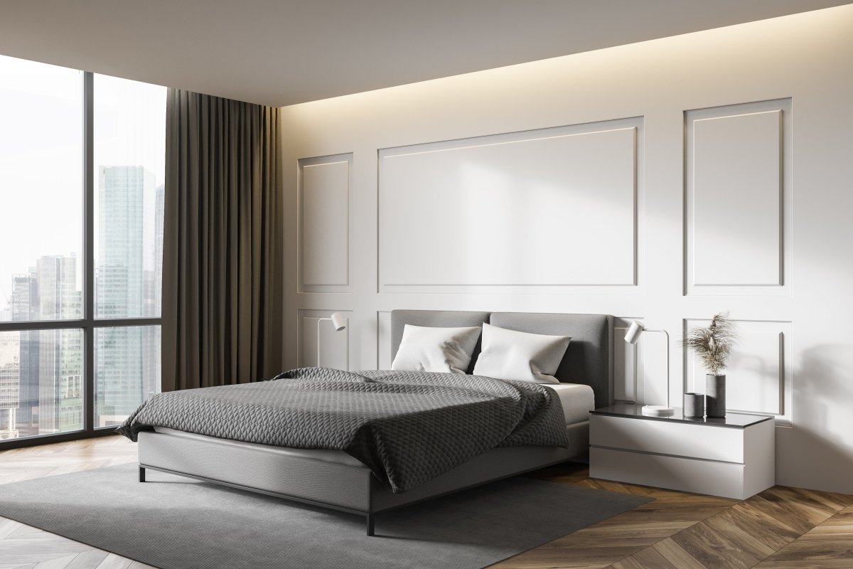
Statement Walls
A statement wall is still one of the simplest ways to bring in bold color without reworking the whole room. The key is choosing a wall that already has visual authority. In a bedroom, that is usually behind the bed. In a living room, it is often behind the sofa or fireplace. In a kitchen or bath, it may be the wall where tile, cabinetry, or stone already gives the eye a place to land.
A common mistake is choosing the brightest wall opportunity rather than the right focal wall. If the room already has a strong element, a large window, open shelving, dramatic art, heavy drapery, the wrong accent wall can split attention instead of concentrating it.
Choosing the right wall to make a statement
Look for the wall the room naturally wants to emphasize. If you have to explain why that wall is the feature, it probably is not. Good statement walls feel inevitable once the furniture is in place.

(source: @architecttiles)
Bold color placement ideas
If you want your statement wall to stand out cleanly, let the surrounding walls recede. If you want the room to feel more enveloping, carry the hue farther across the trim, ceiling, or millwork. The second approach usually looks calmer than people expect because the eye stops reading hard edges and starts reading one continuous envelope.
If you like the idea of using one shade everywhere, you’ll love color drenching, where the walls, trim, doors, and even the ceiling share one hue for a calmer, more architectural look.

(source: @yourstylishhomeuk)
Considerations for accenting with decor
Once the wall is carrying a strong color, the rest of the room should either echo it quietly or steady it. Neutral accents like ivory, black, warm wood, brushed metal, or stone help the color feel resolved. Repeating the exact wall color in small details can also work, but it usually looks strongest when the materials change. A matte wall, velvet chair, and glazed ceramic in the same family will feel richer than one flat match repeated everywhere.

(source: @kirstenfrancis)
Bold Accent Pieces
If painting a wall feels too committal, bring color in through something that can move. Upholstery, rugs, lamps, art, pillows, and drapery all let you sharpen the room without locking the architecture into one decision. This is often the better first step for people who love color but are still learning how much intensity they actually want to live with.
Furniture is usually the biggest commitment in this category, so choose the one piece you want to carry the room. A colorful sofa has more visual weight than a side chair. A rug with a strong palette affects nearly every object that sits on top of it. That is why a colorful sofa or a rug with a cool pattern can be enough on its own in a quiet room.

Texture matters here more than people think. Velvet makes saturated color feel deeper and moodier. Bouclé diffuses it. Leather tends to look denser and cleaner. A glossy ceramic lamp can read almost jewel-like, while a chalky painted finish softens the same hue. The point is not just to add color. It is to decide what kind of color presence you want.
The mistake most people make is buying two or three statement pieces at once. A bold sofa, bright rug, and loud art wall can work, but only when one clearly leads. If you are building the room piece by piece, choose the dominant accent first and let everything else answer it.

Art and accessories are where you can be slightly bolder without creating a renovation problem. A strong piece of art can carry a color story for the whole room. Lamps, vases, and textiles can repeat it in smaller beats. That repetition is what makes the room feel composed instead of randomly colorful.
Accessories like statement curtains, wall art, or colorful throw pillows can absolutely help bring a room together, but they work best when they are echoing a palette that already exists somewhere else in the room.

(source: @shelleycarline_design)
Balancing Bold Colors with Neutrals
Neutrals are not the boring part of the palette. They are the part that gives bold color room to breathe. A warm off-white, a dry taupe, charcoal, blackened bronze, pale oak, walnut, limestone, concrete, and soft gray all change how a saturated color reads beside them. If your bold color feels too sweet, add a drier neutral. If it feels too severe, bring in warmth through wood, linen, or a creamier base.
One useful rule of thumb is to let the room stay mostly quiet. Think of the palette as roughly 70 percent grounding neutrals, 20 percent supporting materials and secondary tones, and 10 percent true color punctuation. It is not a law, but it keeps many rooms from tipping into visual noise too quickly.

Texture and pattern also help absorb intensity. A textured rug can keep a room interesting even when the overall palette is restrained. The opposite is also true. If the room already has patterned stone, dramatic veining, high-contrast upholstery, or busy art, your bold color may need to be simpler than you first imagined.
A common real-world problem is choosing bold paint before the rug, art, and upholstery are finalized. That sequence often backs you into a corner.
If the furniture is still fluid, start with the movable layer first. If the architecture is already fixed and beautiful, start with the wall or tile.

By starting with a grounded neutral base and letting bold color arrive with intention, you get the best version of modern color. The room feels awake, but still edited.


Ready to Get Started?
You do not need a fearless personality to use bold color well. You need a point of view, a little patience, and a willingness to let one decision lead the room. Start with the surface or object that should carry the most energy, test it in real light, and let the rest of the palette steady it. That is usually where modern color stops feeling risky and starts feeling deliberate.
Frequently Asked Questions

Todd Harmon
Bold color earns its place when it feels tied to material, light, and proportion rather than used as a shortcut to personality. That balance, between atmosphere and restraint, is central to Todd Harmon’s view of what makes a room feel finished. With over two decades in e-commerce and product curation, Todd’s work is defined by a rejection of sterile minimalism in favor of the "moody interior." As the creative architect behind AURA Modern Home, his focus lies at the intersection of mid-century architecture and contemporary shadow, prioritizing material authority and the psychological impact of a well-composed room.

Leave a comment
This site is protected by hCaptcha and the hCaptcha Privacy Policy and Terms of Service apply.